
STATISTICS
Statistics is the branch of science of collecting, classifying and analyzing information using numbers.
Types of statistics
Types of statistics
a) Descriptive statistics
Are techniques concerned with careful collection, organization, summarizing and analyzing from large set of data. It is obtained from field work and where the population is large. Examples are population census, harvest temperature.
b) Inferential statistics
These are techniques concerned with careful collection, organization, summarizing, analysis and drawing conclusion from samples.Samples are small data taken as representatives to give the probability of aspects of geography.
FORMS OF STATISTICS
Statistical data can be sub-divided into two major forms. Parametric data and non –parametric data
1.Parametric data- is also known as continuous data, it is data which is capable of having subdivision such values are 1.25, 2.65, 3.0, 2.5 and other can be obtained
2.Non- parametric data- known as Discrete data obtained by counting or ranking such values as 10,25, 35 etc.
These two types of data can expressed in
different levels or scales such level or scale are:-
i.Nominal scale – They type of scale where classification and counting are made e.g A, B, F,. It is simply means the system of assigning number in order to label them
ii.Ordinal scale: is a scale which attempts to rank data in order.
iii.Interval scale: Scale used to adjust values into equal form
iv.Ratio scale: It have an absolute or true zero of measurement foristance the zero point on a centimeter scale indicate the complete obsceneof length or height.
VARIABLE
Is anything/characteristics that may have or an attribute which change in value, under given condition. Variable can be classified into two major forms:- 1.Independent variable- it is a variable factor which influence the changes of other variable e.g. Sex, year etc. It is expressed on the x axis
2.Dependent variable – an outcome or result which has been influenced by other variable e.g. The higher the attitude the lower the temperature and viceversa.
FORMS OF STATISTICS
Statistical data can be sub-divided into two major forms. Parametric data and non –parametric data
1.Parametric data- is also known as continuous data, it is data which is capable of having subdivision such values are 1.25, 2.65, 3.0, 2.5 and other can be obtained
2.Non- parametric data- known as Discrete data obtained by counting or ranking such values as 10,25, 35 etc.
These two types of data can expressed in
different levels or scales such level or scale are:-
i.Nominal scale – They type of scale where classification and counting are made e.g A, B, F,. It is simply means the system of assigning number in order to label them
ii.Ordinal scale: is a scale which attempts to rank data in order.
iii.Interval scale: Scale used to adjust values into equal form
iv.Ratio scale: It have an absolute or true zero of measurement foristance the zero point on a centimeter scale indicate the complete obsceneof length or height.
VARIABLE
Is anything/characteristics that may have or an attribute which change in value, under given condition. Variable can be classified into two major forms:- 1.Independent variable- it is a variable factor which influence the changes of other variable e.g. Sex, year etc. It is expressed on the x axis
2.Dependent variable – an outcome or result which has been influenced by other variable e.g. The higher the attitude the lower the temperature and viceversa.
DATA PRESENTATION
Is the process of organizing data and presenting them into different ways or forms, This include linear graphs pie chart, bar proportional diagrams, polygons and others.
Is the process of organizing data and presenting them into different ways or forms, This include linear graphs pie chart, bar proportional diagrams, polygons and others.
- LINE/LINEAR GRAPHS
General procedures to present data using linear graphs
i) Get the data needed for the purpose
ii) Identity the depended and independent variable
iii) Decide on the vertical scale based on the graph space and values of the dependent variable available
iv) Decide on the horizontal spacing of the graph determined by graph space available
v) Draw and divide the vertical and the horizontal axes according to respective scale
vi) Plot the point
vii) Join the points to get the graph
viii) Write the title of the graph appropriately
ix) Indicate the scale appropriately
x) Show the key where necessary
ii) Identity the depended and independent variable
iii) Decide on the vertical scale based on the graph space and values of the dependent variable available
iv) Decide on the horizontal spacing of the graph determined by graph space available
v) Draw and divide the vertical and the horizontal axes according to respective scale
vi) Plot the point
vii) Join the points to get the graph
viii) Write the title of the graph appropriately
ix) Indicate the scale appropriately
x) Show the key where necessary
TYPES OF LINE GRAPHS
a) Simple line graphs
b) Group (comperative) line
c) Compound line graph
d) Divergent line graphs
SIMPLE LINE GRAPH
This is a graph drawn to show the variation of distribution of a single item using line.
Procedure for construction refer to generally procedure for drawing line graph.
This is a graph drawn to show the variation of distribution of a single item using line.
Procedure for construction refer to generally procedure for drawing line graph.
For Example:Temperature values for station x
Months | Jan | Feb | Mar | Apr | May | Jun | July | Aug | Sept | Oct | Nov | Dec |
Tempe(0C) | 23 | 24 | 26 | 28 | 29 | 28 | 26 | 26 | 27 | 26 | 25 |
A SIMPLE LINE GRAPH SHOWING MONTHLY TEMPERATURE FOR STATION X


Advantage of simple line graph
- They are simple to draw and interpret
- The continuous nature of a line or curve make technique suitable for showing data which in continuity e.g. Temperature
- Variations such as sudden rise or drop values are visually clear.
- It is easy to read the exact values against plotted point in straight line graph.
Disadvantage of simple line graph
- The record limit representation of only one item on graph
- They can give false impression on continuity of data even when there are periods when data is not available
- They do not give a clear visual impression of actual quantities.
GROUP/COMPERATIVE LINE GRAPH
These are a series of line graphs that are drawn on the same charts. They show the relationship between sets of similar statistics for two or more items.
Note the following:
a) The line drawn should not be uniform
b) The number of line that a graphs should not exceed five (3)
b) The number of line that a graphs should not exceed five (3)
Example: Drawn a group line graph to present cashew nut production in tonnes among four Regions of Tanzania
Region year | Lindi | Mtwara | Ruvuma | Coastal |
1970 1971 1972 | 10 20 15 | 30 35 45 | 15 20 20 | 40 35 05 |
GROUP LINE GRAPH TO REPRESENT CASHEW NUT PRODUCT IN LINDI, RUVUMA, MTWARA AND COASTAL REGIONS FROM 1970 TO 1972

Scale:-
Vertical scale : 2cm to 10 tones
Horizontal scale: 4cm to 1 year
Horizontal scale: 4cm to 1 year
Advantages of group comperative line graph
- Give comperative analysis of data
- Saves space and time since they are on one space
- Have good visual impression if well drawn
Disadvantage of comperative line graph
- Can be overcrowded if the set of data is many
- Easy to confuse with compound line graph
COMPOUND LINE GRAPH
Compound line graph is made of two or more lines which are drawn horizontally. Each line indicates are item different year/region.
An example of compound line graph to show the maize production in three villages from 2000 to2002 in 000 tones
An example of compound line graph to show the maize production in three villages from 2000 to2002 in 000 tones
Year | Winome | Mdandu | Mtwango |
2000 | 20 | 35 | 40 |
2001 | 40 | 35 | 65 |
2002 | 50 | 70 | 80 |

KEY
Vs : 1Cm = 20 tonnes
H s : 5Cm = year
Advantage of compound line graph
Vs : 1Cm = 20 tonnes
H s : 5Cm = year
Advantage of compound line graph
- Total value are dearly shown for overall conclusion and suggestion
- It bring usual impression which encourage understanding for interpreter
- Combining several graphs in one save space
Disadvantage of compound line graph - The calculation involved are difficult and time consuming
- Drawing is very difficult and time ensuring
- Interpretation may be difficult as well
DIVERGENCE LINE GRAPH
Are graphs which represents negative (minus value) and positive (plus value) around a mean. They are loss and gain graphs which show divergence or variation between export and import or profit and loss etc.The mean is represented by zero axis drawn horizontally across the graph paper.
Are graphs which represents negative (minus value) and positive (plus value) around a mean. They are loss and gain graphs which show divergence or variation between export and import or profit and loss etc.The mean is represented by zero axis drawn horizontally across the graph paper.
For example Present the following data into divergent line graph.
Year | Production (tonnes) |
1960 | 2,000 |
1970 | 2,000 |
1980 | 1,500 |
1990 | 4,000 |
Construction Procedures:-
i)Calculate the sum of the dependent variable.
Eg. 2,000 +2,500 + 1,500 +4,000
=10,000 tonnes
ii) Calculate the Arithmetic mean of the value of the dependent variable.
iii) Find the deviation from the mean of each value:
Eg. 2,000 +2,500 + 1,500 +4,000
=10,000 tonnes
ii) Calculate the Arithmetic mean of the value of the dependent variable.

iii) Find the deviation from the mean of each value:
Year | X | (X –X) |
1960 | 2,000 | -500 |
1970 | 2,500 | 0 |
1980 | 1,500 | +1000 |
1990 | 4,000 | +1500 |
iv) Identify the for example dependent is deviations and independent variable is year of production.
v) Determine the vertical scale.Assuming the graph space available is 10Cm
vi) Write the tittle and scales of the graph
BAR GRAPHS
Are the graphs drawn to show variation of distribution of items by means of bars.
v) Determine the vertical scale.Assuming the graph space available is 10Cm

vi) Write the tittle and scales of the graph

BAR GRAPHS
Are the graphs drawn to show variation of distribution of items by means of bars.
TYPES OF BAR GRAPHS
a) Simple bar graph
b) Group/comperative bar graphs
c) Compound bar graphs
d) Divergent bar graphs
A) SIMPLE BAR GRAPHS
This graphs express single item per bar and represent simple data.
Example: Draws a bar graph to represent Tanzania sisal export
Year | Export by value (Tshs 000) |
108,100 | |
1981 | 100,400 |
1982 | 145,500 |
1983 | 160,000 |
A BAR GRAPH TO REPRESENT TANZANIA SISAL EXPORT 1980 TO 1983
Advantages of Simple bar graph

Advantages of Simple bar graph
- They are relatively simple to draw
- Easy to read and interprate
- Bar represent tangible quantities better than line
- Have good visual impression
Disadvantages:-
- The method is limited, it is capable of representing only one item per graphs
- They are not suitable for cumulative data
- Consume space if data are many.
GROUP (COMPARATIVE ) BAR GRAPH
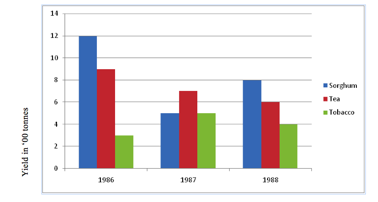
For example.Present the data shown in a table into comperative bar graph to show agricultural products exports from 1988 to1990
For example.Present the data shown in a table into comperative bar graph to show agricultural products exports from 1988 to1990
1988 | 1989 | 1990 | |
Community | |||
Maize | 1,200 | 5,000 | 10,000 |
Fruit | 900 | 700 | 1200 |
Coffee | 5,000 | 7000 |
GROUP BAR GRAPH SHOWING EXPORT OF AGRICULTURAL PRODUCTS IN METRIC TONNES.

scale:
HS:3cm=1year
VS:1cm=100 tonnes
Advantage of group bar graph
a) Value in their totals are expressed well for illustration of points.
b) Construction is relatively simple hence easy
c) Interpretation is also relatively simple and easy.
d) The important of each item/component is clearly shown.
b) Construction is relatively simple hence easy
c) Interpretation is also relatively simple and easy.
d) The important of each item/component is clearly shown.
Disadvantages
a)The comparison of totals of items is difficult
b)Trends cannot be expressed easily e.g. Price and demand rise and falls.
a)The comparison of totals of items is difficult
b)Trends cannot be expressed easily e.g. Price and demand rise and falls.
COMPOUND/DIVIDED BAR GRAPH
This method of data presentation involve construction of bar which are divided to segments to show both individual and cummulative values of item. The length of each segment represent the contribution of an individual item while that of whole bar represents the contribution of the cummulative items in each group.
This method of data presentation involve construction of bar which are divided to segments to show both individual and cummulative values of item. The length of each segment represent the contribution of an individual item while that of whole bar represents the contribution of the cummulative items in each group.
Example: Potatoes production in 000 Sacks
Year | Kihesa | Mtwango | Isakalilo |
2000 | 20 | 35 | 40 |
2001 | 40 | 40 | 50 |
2002 | 50 | 70 | 70 |
2003 | 60 | 75 |
⇒Create a cumulative table
Year | Kihesa | Mtwango | Isakalilo |
2000 | 20 | 55 | 95 |
2001 | 40 | 80 | 130 |
2002 | 50 | 120 | 190 |
2003 | 60 | 135 | 215 |
BAR GRAPH TO REPRESENT POTATO PRODUCTION IN 000 SACK

Scale
- Horizontal scale 1cm to 1 year
- Vertical scale 1 cm to 30,000 sacks
Advantages of compound bar graph
- It is easy to ready the highest and the lowest totals at a glance by comparing the size of the segments
- They give clear visual impression of the total value
- The increase and decrease the grand total values is easy to see
Disadvantages of compound bar graph
- They are relatively difficult to construct and interprate
- Difficult to represent large number of components due to long bars with many segments
- Time consuming.
Divergent bar graph
Instead of divergent line graphs, the data can be presented in divergent bar either horizontally or vertically.
For example:Present the data below by using divergent bar graph to show sisal production in different years
Instead of divergent line graphs, the data can be presented in divergent bar either horizontally or vertically.
For example:Present the data below by using divergent bar graph to show sisal production in different years
Year | Production (tonnes) |
1960 | 2,000 |
1970 | 2,500 |
1980 | 1,500 |
1990 | 4,000 |
Procedures:-
i.Find the deviation from the mean of each value.
i.Find the deviation from the mean of each value.
2,000 + 2,500 + 1,500 + 4,000 = 10,000 tonnes
Year | X | X – X |
1960 | 2,000 | -500 |
1970 | 2,500 | 0 |
1980 | 1,500 | +1000 |
1990 | 4,000 | 1500 |
ii.Insert tittle of the graph
iii.Insert the scale of the graph
DIVERGENT BAR GRAPH TO PRESENT SISAL PRODUCTION IN VILLAGE X FROM 1960,1970,1980 AND 1990.
Advantage of Divergent line graph
a) It is simple to construct and interpret
b) A divergent shows fluctuations of items from the mean.
c) It show both the positive e.g. Profit and the negative e.g. Losses.
iii.Insert the scale of the graph
DIVERGENT BAR GRAPH TO PRESENT SISAL PRODUCTION IN VILLAGE X FROM 1960,1970,1980 AND 1990.

Advantage of Divergent line graph
a) It is simple to construct and interpret
b) A divergent shows fluctuations of items from the mean.
c) It show both the positive e.g. Profit and the negative e.g. Losses.
Disadvantage
a) It involves calculations which right to be both time consuming and difficult.
b) Interpretation needs special statistical skills of which one may lack.
c) Limited only to one item per graph.
a) It involves calculations which right to be both time consuming and difficult.
b) Interpretation needs special statistical skills of which one may lack.
c) Limited only to one item per graph.
DIVIDE CIRCLE/PIE CHART
Is a divided circle which drawn show the distribution of item or items in terms of degrees.
In drawing divide circle all items values must be converted into degree values.
Total degrees of a circle =3600
3600 = 100% |
Construction of Divide circle
Example:- carefully study the table below which show the use of soft drinks at chapamaji village in crates
Type of soft drink | Fanta | Pepsi | Mirinda | Novida | |
Number of crates | 300 | 150 | 250 | 100 | 200 |
a) Draw pie chart to present data above
b) Give merits and demerits of the method you use (a in “a” above)
b) Give merits and demerits of the method you use (a in “a” above)
Solution
Procedures to draw a pie chart
i.To find total of items
Total = Sum of all items (soft drinks) consider the table below:
Procedures to draw a pie chart
i.To find total of items
Total = Sum of all items (soft drinks) consider the table below:
Soft Drink | Coca | Fanta | Pepsi | Mirinda | Novida | Total |
Number of crate | 300 | 150 | 250 | 100 | 200 | 1000 |
Total = 300+ 150 + 250 + 100 +200
=1000 crates.
ii. Step:- To change each type of soft drink into degree values.
iii.To draw pie chart. Drawing pie chart the obtained angles inserted in a circle by using protractor.
=1000 crates.
ii. Step:- To change each type of soft drink into degree values.

iii.To draw pie chart. Drawing pie chart the obtained angles inserted in a circle by using protractor.
DIVIDE CIRCLE TO SHOW THE DISTRIBUTION OF SOFT DRINKS

- Merits of pie chart
i. It is simple to construct.
ii. It is easy to interpret as they use both degree and percent
iii. It gives visual idea as the shades us
iv. It does not hide other feature when left unshaded
v. It has wide variety of uses in geographical field.
vi. It is useful to compare regions of high and low production.
Disadvantage of Pie Chart.(demerits)
i. It involve some mathematical calculation i.e difficult to construct.
ii. When drawn in percentage become difficult to interpret.
iii. It is time consuming
iv. It is difficult to select shade textures for many items
v. It is difficult to read exact values because reference can be made to a scale
ii. It is easy to interpret as they use both degree and percent
iii. It gives visual idea as the shades us
iv. It does not hide other feature when left unshaded
v. It has wide variety of uses in geographical field.
vi. It is useful to compare regions of high and low production.
Disadvantage of Pie Chart.(demerits)
i. It involve some mathematical calculation i.e difficult to construct.
ii. When drawn in percentage become difficult to interpret.
iii. It is time consuming
iv. It is difficult to select shade textures for many items
v. It is difficult to read exact values because reference can be made to a scale
Importance of statistics
- Helps in the comparison of different geographical phenomena for example climate, population, commodity and production.
- Used to summarize raw and bulk data for easy interpretative and visual explanation.
- It facilitates land use planning
- Helps resources allocation and provision of social services for example food, health, water, education.
- Makes it easy to compare data
- Its knowledge simplifies research activities
SUMMARIZATION OF MASSIVE DATA
Raw data collected from various sources does not tell users much unless they are organized in summary form. This process of summarizing data in an organized form makes sense out of the scored information.
This brings the necessity to geographer’s of summarizing massive data which could be done in the following ways:-
- Frequency distribution
Frequency distribution help to determine how many times a certain scores are arranged/occurs in that presentation. The technique consist of a table in which different scores are arranged in their rank order. It is advised ti start with the highest/largest value and back to the smallest That is in descending order
E.g: Use the data below which express a population survey in a certain region
- The raw information found that the family size of 20 families interviewed was 3,2,2,4, 3, 7, 8, 1, 3, 6, 2, 2, 4, 5, 6, 4, 3, 4, 5 and 2
- Arrange the scores in lending order from 8 to 1
- Distribute each score in the representation to get how many times each score
occurs. This process of distribution is called tallying
Distribution of the score to get their frequency

The frequency which means the number of times a score or event appears or occurs is obtained. At time one is confronted with a large number of scores or event involving a whole region this is certainly difficult to handle if one deals with each score or event separated. The world is made simpler and easy by the use of grouped frequency. Be low are the steps involved in making grouped frequency.
Decide the size of the class interval. This is actually the number of scores or events in each class. But is important to know the characteristics class internal in order to be able to make classes.
a) A score appears only once. That means no score should be long to more than one class.
b) The size of the class intervals should be uniform
c) The class intervals should always and be continuous
d) The range of class intervals should be between 3 and 20. Thus, the intervals should not be below 3 and above 20.
e) Decide on the number of class intervals needed.
f) Ensure that the class intervals are the same size.
Ensure that no score falls in more than one class interval. Arrange the class intervals in order of ranks preferably in a descending order.
b) The size of the class intervals should be uniform
c) The class intervals should always and be continuous
d) The range of class intervals should be between 3 and 20. Thus, the intervals should not be below 3 and above 20.
e) Decide on the number of class intervals needed.
f) Ensure that the class intervals are the same size.
Ensure that no score falls in more than one class interval. Arrange the class intervals in order of ranks preferably in a descending order.
From the summarized data above one can identify two concept.
i) Apparent upper limit
ii)
Apparent lower limit
ii)
Apparent lower limit
These limits are the values which are seen in each class internal. The apparent lower limit opens the class interval while the apparent upper limit close the class interval.
Presentation of frequency

The table shows 80, 70, 60, 50, 40, 30, 20, and 10 as apparent lower limits and 89, 79, 69, 59, 49, 39 29, 19 and 9 as the apparent upper limits
A part from the two concepts above the table also has real limits which are not visible which are 0.5 below or above the apparent limits.
From the summary made above one can obtain other measures of statistics. Such measures include:-
From the summary made above one can obtain other measures of statistics. Such measures include:-
I. Measure of central tendence
II. Measure of dispersion (variability)
III. Measure of relationship (correlation)
IV. Measure of relative position
SOURCES OF STATISTICAL DATA
a) Primary source
Data are collected from the field. These are original data for example through mail, questionnaire, interviews, observations, survey etc
Data are collected from the field. These are original data for example through mail, questionnaire, interviews, observations, survey etc
b) Secondary source
Data are collecte
d in official sources such as bureau of statistics, census and surveys, government publications, ministry bulletin, individual research work.
Data are collecte
d in official sources such as bureau of statistics, census and surveys, government publications, ministry bulletin, individual research work.
TYPES OF DATA
Individual data
Are exact value given to individual,
For example production of certain commodity, Population etc.
Discrete data
For example production of certain commodity, Population etc.
Discrete data
Are whole numbers assigned to certain item
E.g. 3 people
E.g. 3 people
- 10 trees
- 1 shop
Continuous data
Are data with specific / exact value for example
Are data with specific / exact value for example
- Temperature
- Weight
- Distance
Grouped data
Are data without specific /exact figures groups of several value are used
E.g.
Are data without specific /exact figures groups of several value are used
E.g.
- 0 – 9
- 10 -19
- 20 – 29
PRESENTATION OF MASSIVE STSTISTICAL DATA
When statistics are collected in the field, they are usually in a haphazard form. For the statistics to be useful they need to be processed, arranged in logical manner and presented in such a way that they information can be easy to read and make conclusion.
For this purpose, statistics may be arranged in tables. From the tables the data may be presented in graphical form using graphs and charts.
This include the line and bar graphs as well as proportional circles and pie charts. Statistical data could also be presented in a forms of map i.e flow line maps, dot maps and choropleth maps.
SIMPLE STATISTICAL MEASURE AND INTERPRETATION
Measure of central tendency – Refers as indices of central locations in the distributions these are measures of average a typical performances of geographical aspect especially crop production crop sales, marketability, population sizes and others
These are three measure of central tendency, namely the mean, mode and median
These are three measure of central tendency, namely the mean, mode and median
a) The Arithmetic mean
The average is what we call Arithmetic mean. Arithmetic mean refers as the sum (total) of all scores or events divided by the number of occurrences. Mathematically arithmetic mean is represented as
The average is what we call Arithmetic mean. Arithmetic mean refers as the sum (total) of all scores or events divided by the number of occurrences. Mathematically arithmetic mean is represented as

For example
50, 90, 70, 60, 80, 75, 65, 60, 80, 70 compute the Arithmetic mean of the above geography marks

This is the normal or average pass mark of the students is 70 percent.
b) MODE
Mode is the most frequent score in a data distribution. It is the score or value which occurs more times than any other score or value in a distribution.
Example
2, 7, 8, 9, 2, 3, 1, 3, 2, the mode in the distribution is 2 which occurs 3 times. But sometimes the distribution is shown in a form of grouped data.
Mode becomes useful in statistics in many whys but one of the important whys is when mode is used to describe the content of the distribution of data.
Note: sometimes we may have two modes (bimodal) or more than two.
Median
Median can be defined as the score or value which is most central in the distribution of data or the mid point (middle value) in a distribution or set if score. The set of scores can be in odd or even form.
⇒Suppose the data distribution is odd and simple as shown below:
Mode is the most frequent score in a data distribution. It is the score or value which occurs more times than any other score or value in a distribution.
Example
2, 7, 8, 9, 2, 3, 1, 3, 2, the mode in the distribution is 2 which occurs 3 times. But sometimes the distribution is shown in a form of grouped data.
Mode becomes useful in statistics in many whys but one of the important whys is when mode is used to describe the content of the distribution of data.
Note: sometimes we may have two modes (bimodal) or more than two.
Median
Median can be defined as the score or value which is most central in the distribution of data or the mid point (middle value) in a distribution or set if score. The set of scores can be in odd or even form.
⇒Suppose the data distribution is odd and simple as shown below:
3, 4, 11, 12, 3, 1, 2, 6, 2.
Median is obtained through the following steps
a) Arrange the score in either descending or an ascending orderEg: 1, 2
b) Locate the central most score, where as: from the above data mid score is 3 so that the median is 3
⇒Suppose the data distribution is simple but even the median is obtained through the following procedures given the distribution below:
15, 13, 3, 7, 4, 6, 11, 9
Median is obtained through the following steps
a) Arrange the score in either descending or an ascending orderEg: 1, 2
b) Locate the central most score, where as: from the above data mid score is 3 so that the median is 3
⇒Suppose the data distribution is simple but even the median is obtained through the following procedures given the distribution below:
15, 13, 3, 7, 4, 6, 11, 9
a) Arrange the data in descending/ascending order 3, 4, 6, 7, 9, 11, 13, 15
b) Observe the mid point which is either for 9.
c) Get the median by calculating as follows.

The median is therefore at position 4 in either way. From left of the scores, 4 the score is 7 while the right it is 9.

The significance of median is to reveal the position where the data set is made to neutraize the weakness of Arthmetic mean as na average which is influenced by extreme score.
The three measures of central tendency can be combined in data interpretation. This is as follow.
The three measures of central tendency can be combined in data interpretation. This is as follow.
a) When mean, mode and median are the same value, distribution is normal. The pheramena observed biasness.
b) If they are not of the same value, the distribution is normal hence there is biasness
b) If they are not of the same value, the distribution is normal hence there is biasness
Measures of central tendency can be calculated from grouped data.
Example.
Example.
SCORES | FREQUENCY |
0 – 4 | 2 |
5 -9 | 6 |
10 -14 | 10 |
15 -19 | 8 |
20 -24 | 4 |
Assumed mean = 12
C1 | F | X | Real limits | D =x -4 | fol | cf |
0 -4 | 2 | 2 | 0.5 – 4.5 | -10 | -20 | 2 |
5 – 9 | 6 | 7 | 4.5 -9.5 | -5 | -30 | 8 |
10 – 14 | 10 | 12 | 9.5 -14.5 | 0 | 0 | 18 |
15 – 19 | 8 | 17 | 14.5 – 19.5 | 5 | 40 | 26 |
20 – 24 | 22 | 19.5 – 24.5 | 10 | 40 | 30 | |
Efd = 30 | ||||||


Measure of central tendence can be calculated from a grouped data
Example
Example
Scores | Frequency |
0-4 | 2 |
5-9 | |
10-14 | 10 |
15-19 | 8 |
20-24 | 4 |
Assumed mean =12
Cl | f | x | Real limit | d=x-A | f d | c f |
8-4 | 2 | 2 | 0.5-4.5 | -10 | -20 | 2 |
5-9 | 6 | 7 | 4.5-9.5 | -5 | -30 | 8 |
10-14 | 10 | 12 | 9.5-14.5 | 0 | 0 | 18 |
15-19 | 8 | 17 | 14.5-19.5 | 5 | 40 | 26 |
20-4 | 4 | 22 | 19.5-24.5 | 10 | 40 | 30 |
∑fd=30