
Specific Objectives
By the end of the topic, the learner should be able to:
- Define statistics.
- Collect and organize data.
- Draw a frequency distribution table.
- Group data into reasonable classes.
- Calculate measures of central tendency.
- Represent data in the form of line graphs, bar graphs, pie charts, pictograms, histograms, and frequency polygons.
- Interpret data from real-life situations.
Content
- Definition of statistics.
- Collection and organization of data.
- Frequency distribution tables (for grouped and ungrouped data).
- Grouping data.
- Mean, mode, and median for ungrouped and grouped data.
- Representation of data: line graph, bar graph, pie chart, pictogram, histogram, frequency polygon, and interpretation of data.
Introduction
Statistics is the branch of mathematics that deals with the collection, organization, representation, and interpretation of data. Data is the basic information collected from observations or measurements, which can then be analyzed to draw meaningful conclusions.
Frequency Distribution Table
A frequency distribution table is a data table that lists a set of scores or values along with their corresponding frequencies, showing how often each value occurs in the data set.

Tally
In tallying, each stroke represents a quantity or count. Tally marks are used to keep track of frequencies in an organized and easy-to-read manner.
Frequency
Frequency is the number of times an item or value occurs in a data set.
Mean
The mean, often called the arithmetic mean, is the average value of the data. It is calculated by summing all the values and dividing by the total number of values.

Mode
The mode is the most frequent item or value in a distribution or data set. In the example table above, the mode is 7, which occurs most frequently.
Median
To find the median, arrange the items in order of size. If there are N items and N is an odd number, the median is the item occupying the middle position.
If N is even, the median is the average of the two middle items.
Grouped Data
The difference between the smallest and the largest values in a data set is called the range. Data can be grouped into a convenient number of groups called classes. For example, 30–40 are called class boundaries.
The class with the highest frequency is called the modal class. In this case, it is 50. The class width or interval is obtained by finding the difference between the class limits. For example, 30–40 = 10. To get the midpoint, divide the class width by 2 and add it to the lower class limit.

The mean mass in the table above is:
Mean
Representation of Statistical Data
The main purpose of representing statistical data is to make collected data more easily understood and interpreted. Common methods of data representation include:
Bar Graph
A bar graph consists of a number of spaced rectangles, usually with vertical major axes. Bars are of uniform width. The axes must be labelled, and scales indicated to show the values represented.

The students’ favorite juices are as follows:
- Red: 2
- Orange: 8
- Yellow: 10
- Purple: 6
Pictograms
In a pictogram, data is represented using pictures or symbols, where each picture represents a certain quantity.
Consider the following data:
The data shows the number of people who love the following animals:
Dogs 250, Cats 350, Horses 150, Fish 150

Pie Chart
A pie chart is divided into various sectors, each representing a certain quantity of the item being considered. The size of each sector is proportional to the quantity it represents. Consider the export of the US to the following countries: Canada $13,390, Mexico $8,136, Japan $5,824, France $2,110. This information can be represented in a pie chart as follows:
Canada angle
Mexico
Japan France

Line Graph
Data represented using lines to show trends or changes over time.


Histograms
In histograms, the frequency in each class is represented by a rectangular bar whose area is proportional to the frequency. When the bars are of the same width, the height of the rectangle is proportional to the frequency.
Note:
- The bars are joined together without spaces.
- The class boundaries mark the edges of the rectangular bars in the histogram.

Histograms can also be drawn when the class intervals are not equal.
The information below can be represented in a histogram as shown:
| Marks | 10-14 | 15-24 | 25-29 | 30-44 |
| No. of students | 5 | 16 | 4 | 15 |

Note: When the class width is doubled, the frequency is halved to maintain proportionality.
Frequency Polygon
A frequency polygon is obtained by plotting the frequency against the midpoints of the classes and joining the points with straight lines.

End of topic
Did you understand everything? If not, ask a teacher, friends, or anybody and make sure you understand before going to sleep! |
Past KCSE Questions on the Topic
1. The height of 36 students in a class was recorded to the nearest centimeter as follows:
148, 159, 163, 158, 166, 155, 155, 179, 158, 155, 171, 172, 156, 161, 160, 165, 157, 165, 175, 173, 172, 178, 159, 168, 160, 167, 147, 168, 172, 157, 165, 154, 170, 157, 162, 173
(a) Make a grouped table with 145.5 as the lower class limit and a class width of 5. (4 marks)
2. Below is a histogram; draw:


Use the histogram above to complete the frequency table below:
| Length | Frequency |
|---|---|
11.5 ≤ x ≤ 13.5 13.5 ≤ x ≤ 15.5 15.5 ≤ x ≤ 17.5 17.5 ≤ x ≤ 23.5 |
3. Kambui spent her salary as follows:
| Food | 40% |
| Transport | 10% |
| Education | 20% |
| Clothing | 20% |
| Rent | 10% |
Draw a pie chart to represent the above information.
4. The examination marks in a mathematics test for 60 students were as follows:
| 60 | 54 | 34 | 83 | 52 | 74 | 61 | 27 | 65 | 22 | |||
| 70 | 71 | 47 | 60 | 63 | 59 | 58 | 46 | 39 | 35 | |||
| 69 | 42 | 53 | 74 | 92 | 27 | 39 | 41 | 49 | 54 | |||
| 25 | 51 | 71 | 59 | 68 | 73 | 90 | 88 | 93 | 85 | |||
| 46 | 82 | 58 | 85 | 61 | 69 | 24 | 40 | 88 | 34 | |||
| 30 | 26 | 17 | 15 | 80 | 90 | 65 | 55 | 69 | 89 | |||
| Class | Tally | Frequency | Upper class limit | |||||||||
| 10-29 | ||||||||||||
| 30-39 | ||||||||||||
| 40-69 | ||||||||||||
| 70-74 | ||||||||||||
| 75-89 | ||||||||||||
| 90-99 | ||||||||||||
From the table:
(a) State the modal class.
(b) On the grid provided, draw a histogram to represent the above information.
5. The marks scored by 200 form 4 students of a school were recorded as in the table below:
| Marks | 41 – 50 | 51 – 55 | 56 – 65 | 66 – 70 | 71 – 85 |
|---|---|---|---|---|---|
| Frequency | 21 | 62 | 55 | 50 | 12 |
- On the graph paper provided, draw a histogram to represent this information.
- On the same diagram, construct a frequency polygon.
- Use your histogram to estimate the modal mark.
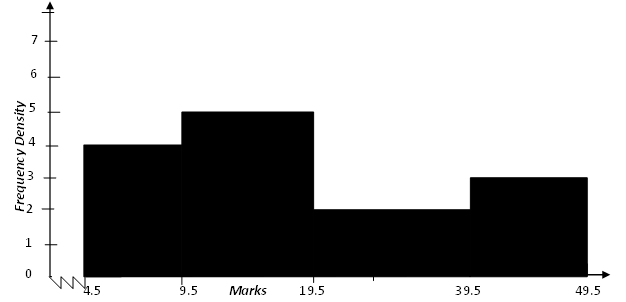
6. The diagram below shows a histogram representing the marks obtained in a certain test:
(a) If the frequency of the first class is 20, prepare a frequency distribution table for the data.
(b) State the modal class.
(c) Estimate: (i) The mean mark (ii) The median mark.


